
Autodex
A shared AR dock for self-guided showroom exploration
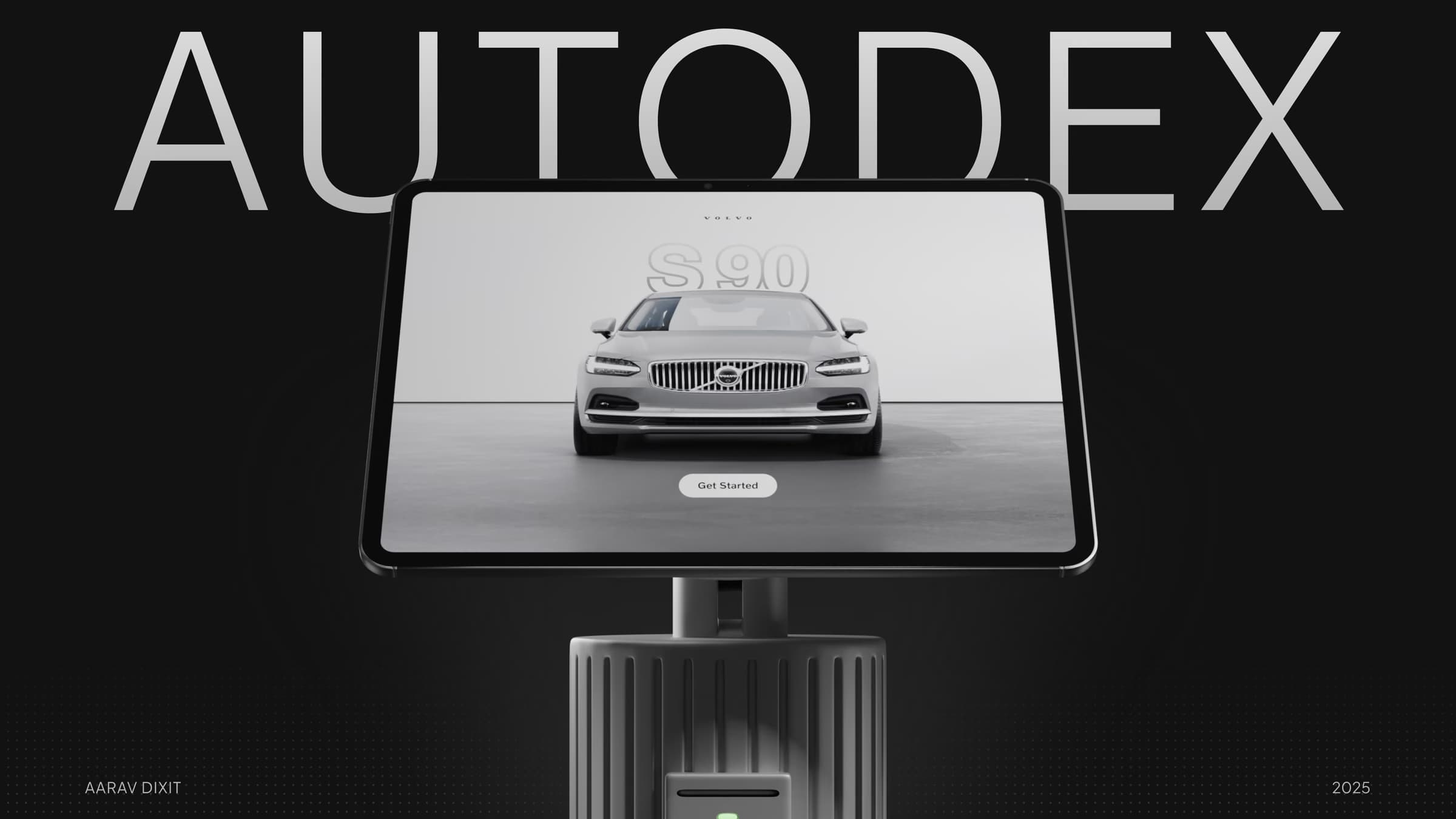
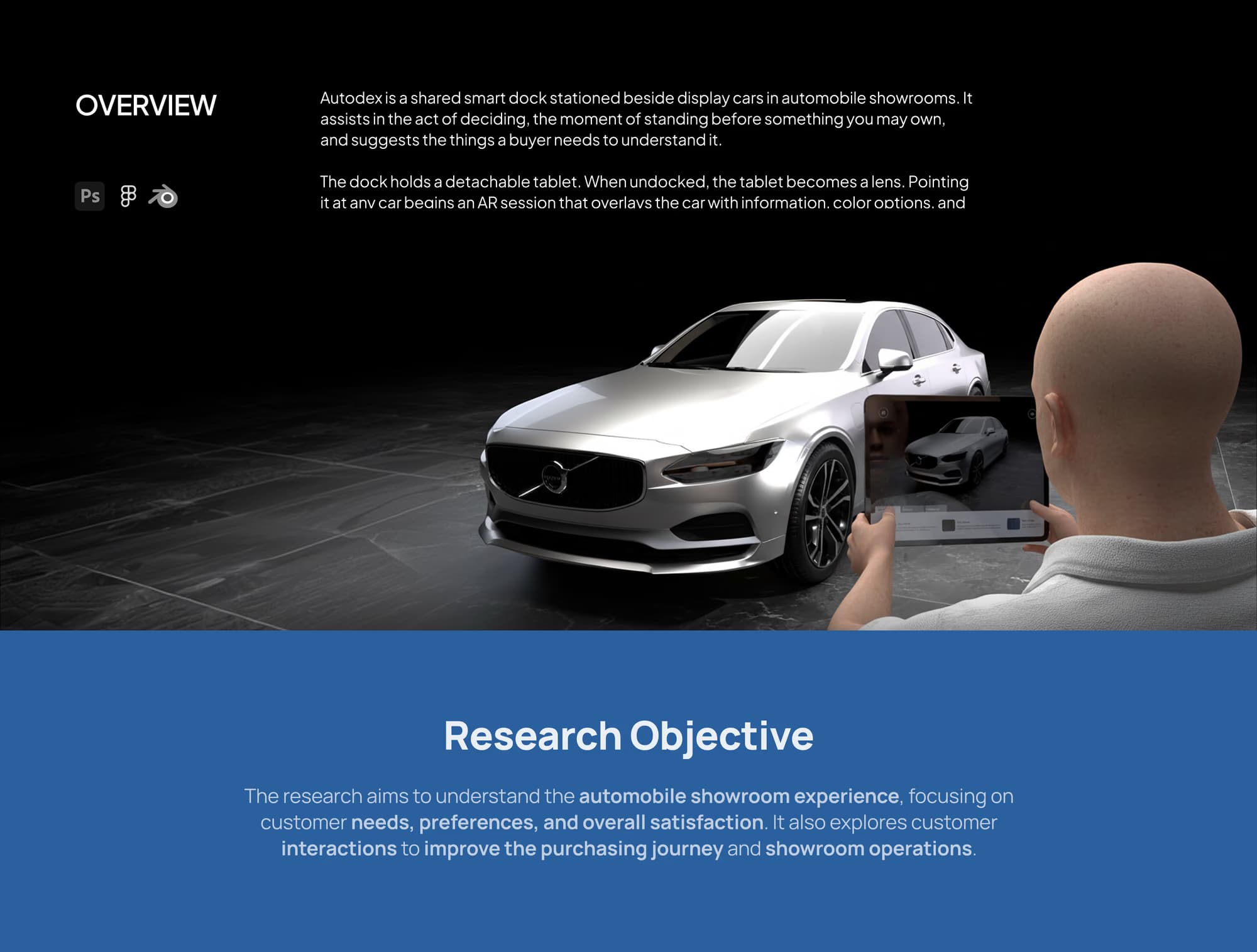
A physical and digital showroom system: a shared dock, a detachable tablet and an AR interface that let buyers explore and compare cars on their own.
- Role
Interaction & UI Design
- Timeline
4 weeks
2025
- Mentor
Sangram Waghule
- Research
4 showroom field visits
Indore
Context
You can stand next to the car and still not know it.
Showrooms put the product right in front of you, then move the conversation to a desk. Visitors end up waiting on whoever is free to explain a feature, and comparing two cars means walking away from both. The information is all there. It just isn't reachable by the person standing in front of the car.

What I designed
Making showroom exploration self-guided.
A physical and digital showroom system: a shared dock, a detachable tablet and an AR interface that let buyers explore, compare and understand vehicles on their own.
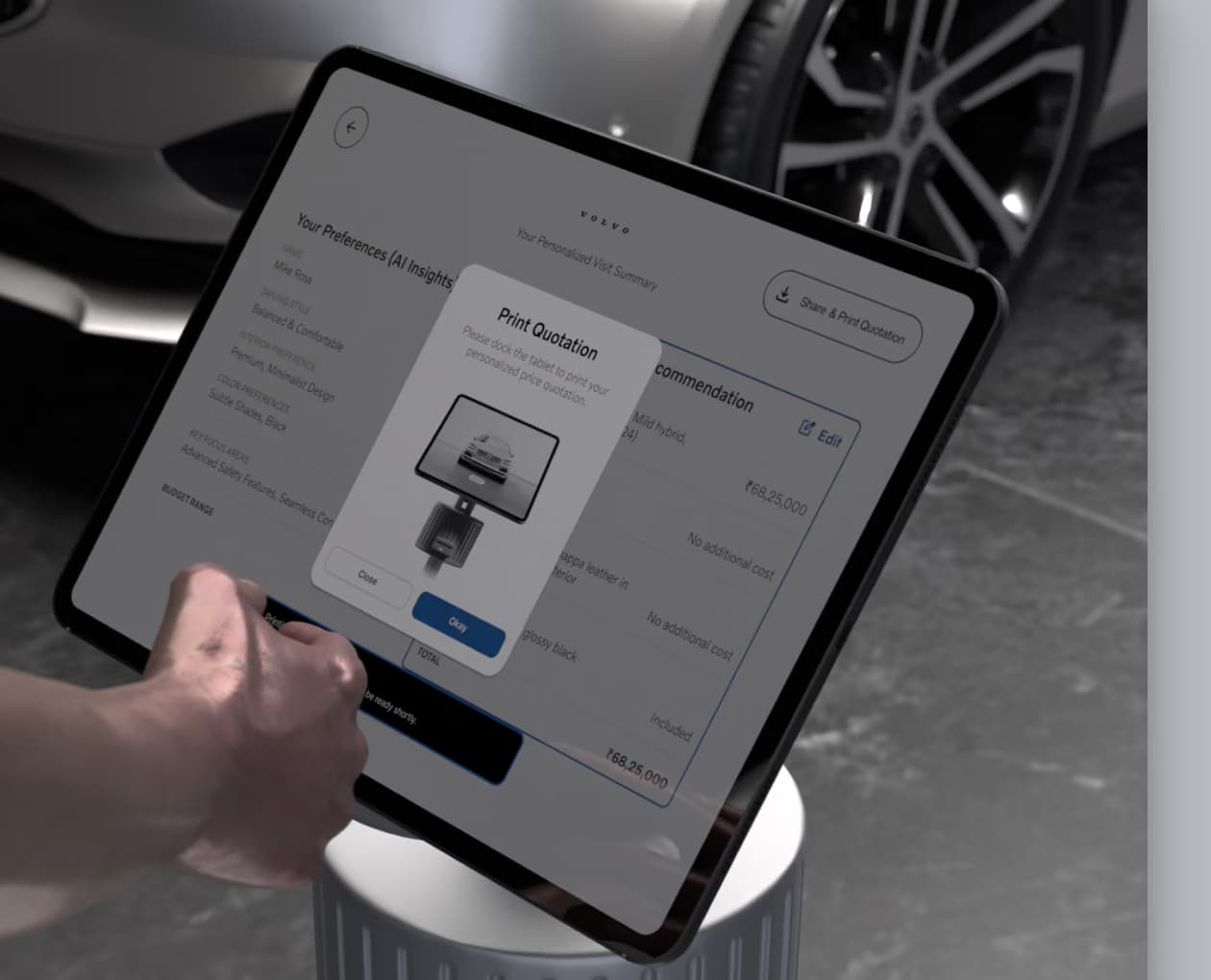
Point the tablet at a car and the car answers. Dock it again and you leave with a quote.
Research
Four showrooms, Indore
How might we make showroom exploration self-guided?
Four showrooms in Indore (MG, Maruti, Kia, Honda). I watched what people walked up to, where they stalled, and what happened when they tried to compare two cars.
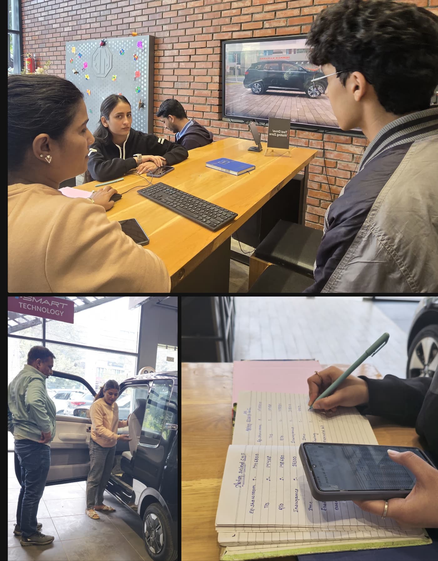
Same story in all four. Exploring was possible but never supported, so every route to understanding ran back through a salesperson.
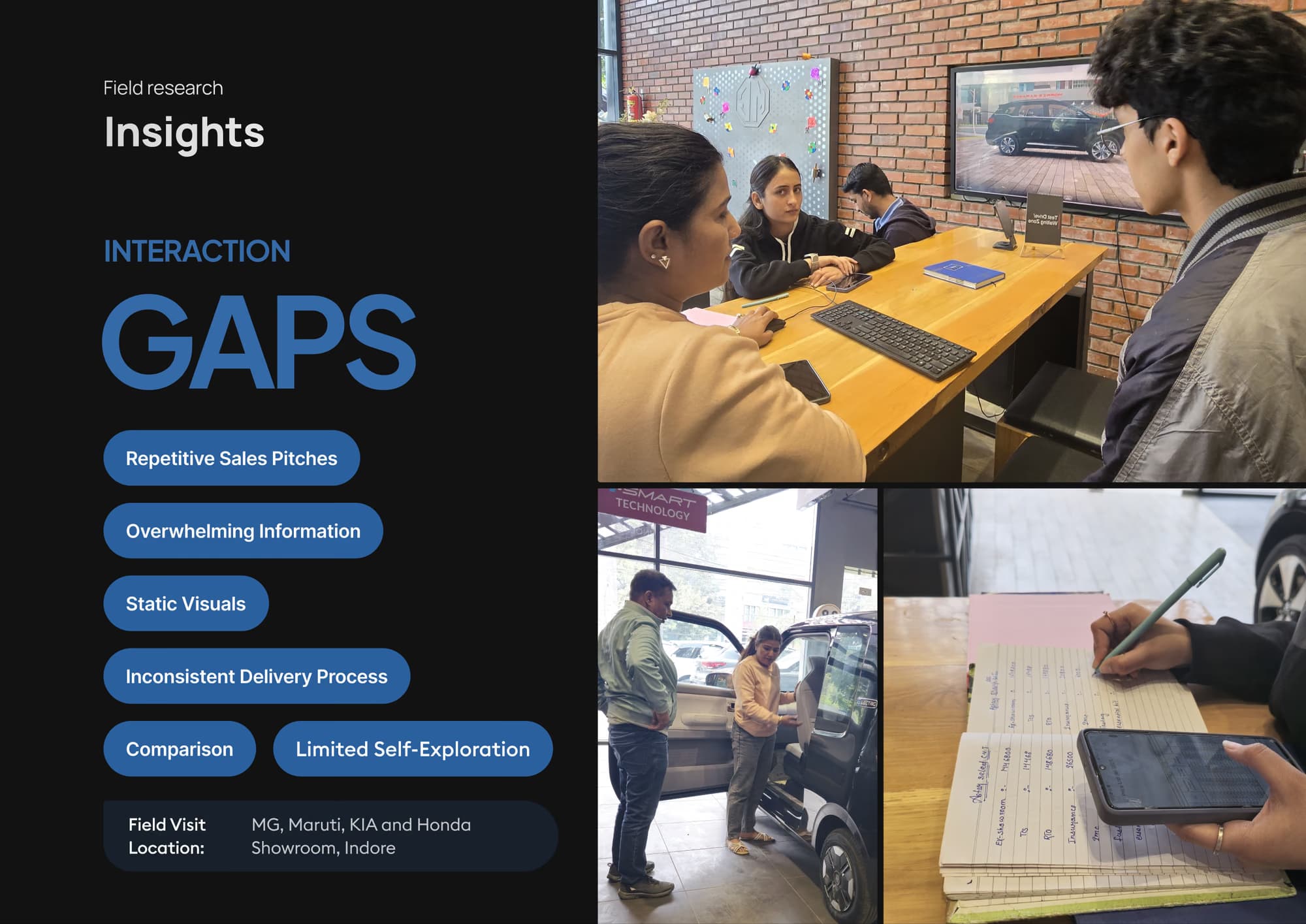
The problem wasn't missing information. It was that nothing let you go and find it.
Decisions
Decision 01
Make it physical.
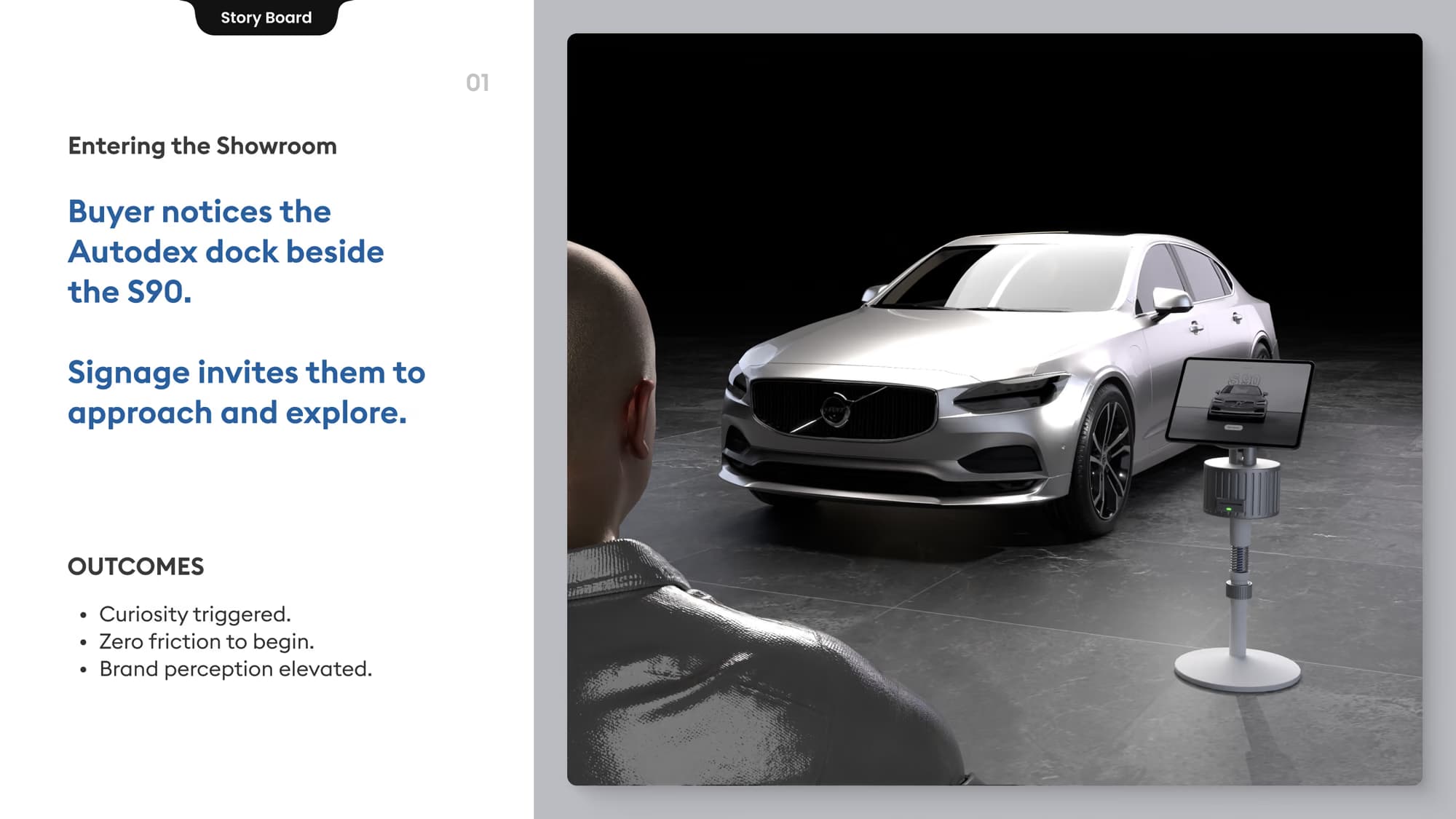
An app would have been easier to build and would have died in the car park. Nobody downloads something to look at a car. So the experience lives on a dock beside each vehicle: nothing to install, and it already knows which car you are standing next to.
Detaching the tablet is the part that matters. It turns a kiosk into something you carry around the car.
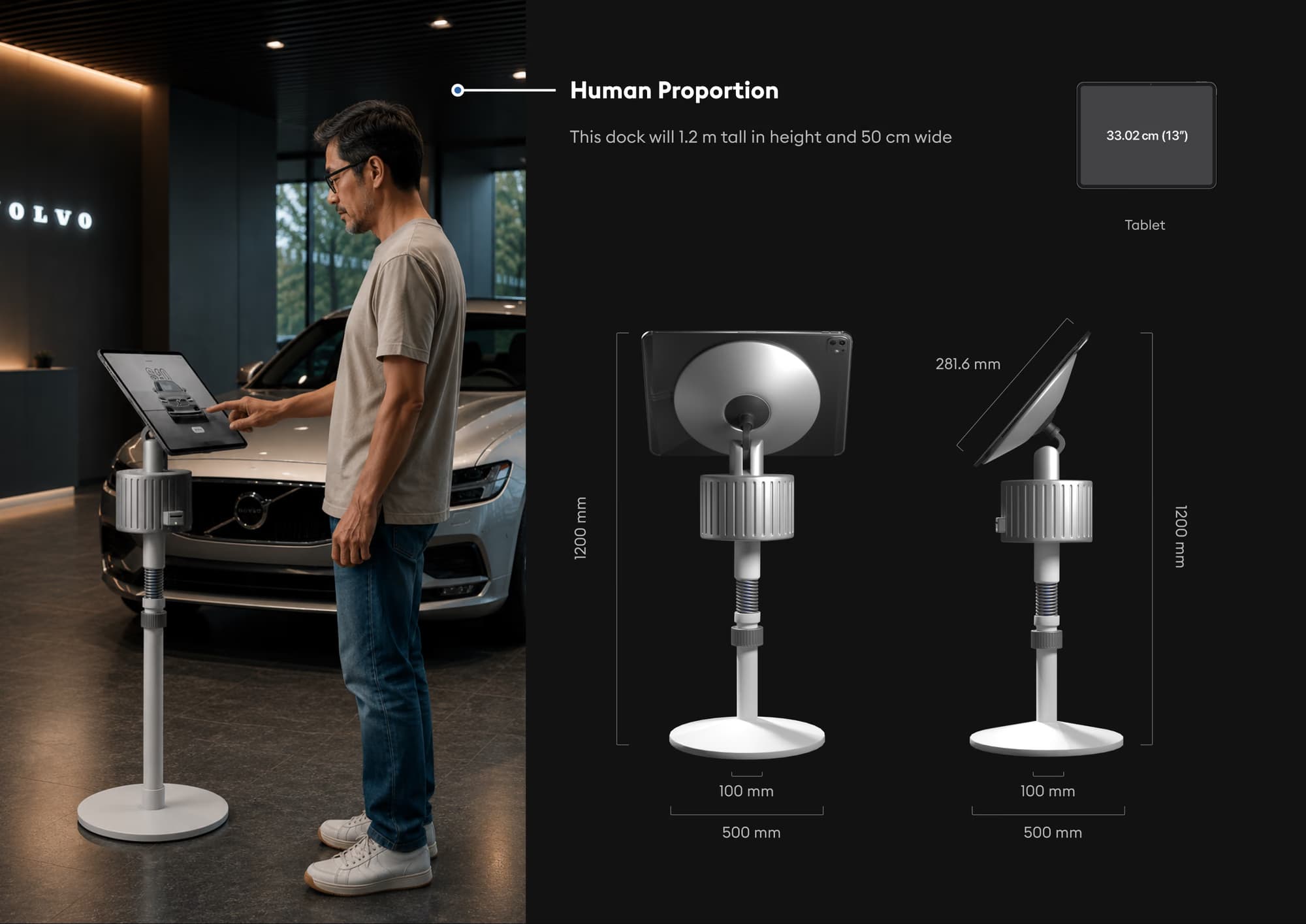
It has to teach itself
A shared object in a public space gets no instructions, so the form does the explaining. The tablet sits proud of the dock so it reads as removable. The collar is knurled because it turns. The print slot has an LED next to it, so the session has a visible ending before anything is printed.


Decision 02
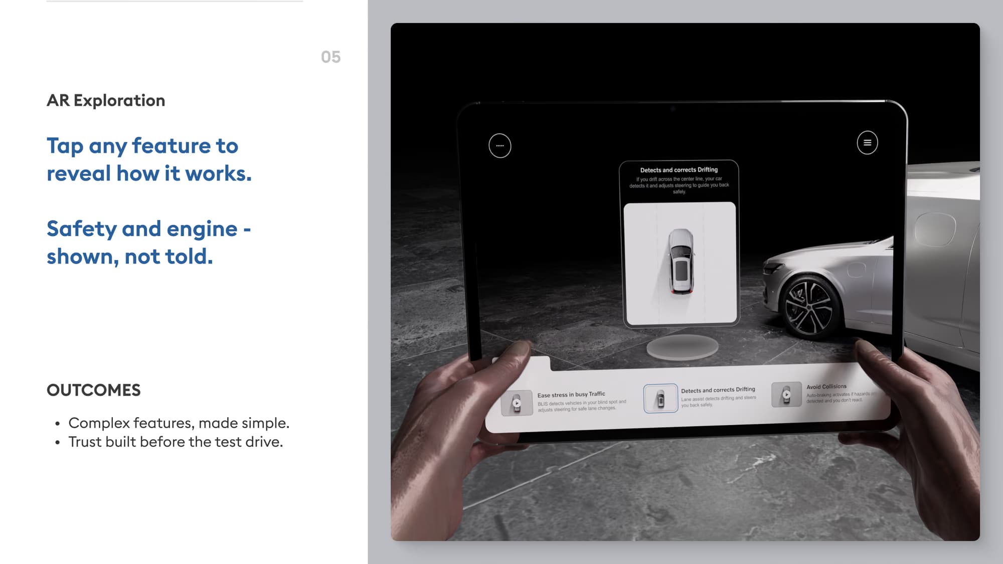
Turn the car into the interface.
The easy version is a catalogue: menus, tabs, spec tables. That just moves the brochure onto a screen and still asks you to match what you are reading against the car in front of you.
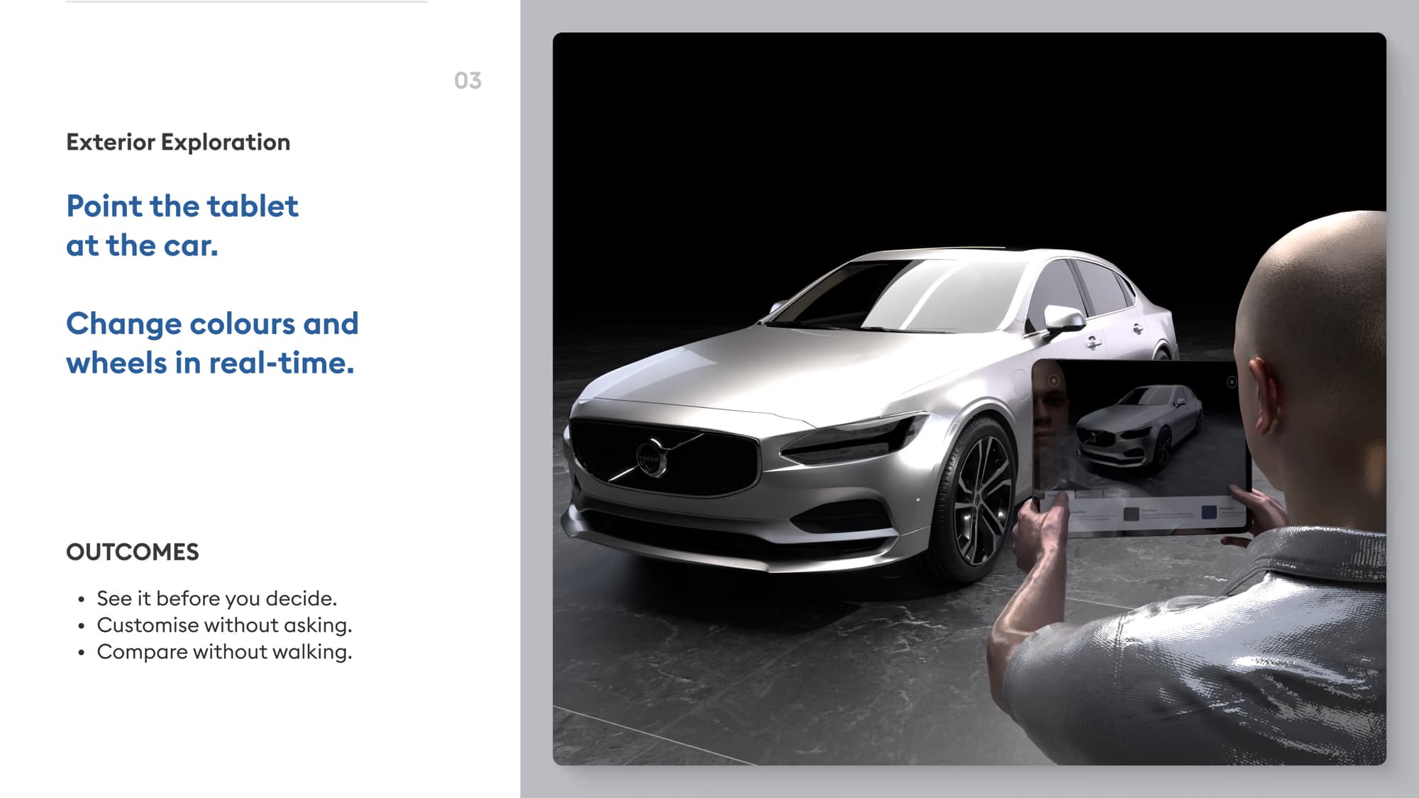
So I put the information on the car. Point at the wheel arch, get the wheels. Point at the bonnet, get the powertrain. Change the paint and it changes on the actual car, at full size, in the showroom's own light.

Decision 03
Design for exploration, not instruction.
Self-guided does not mean unguided. Give someone total freedom in an unfamiliar system and they do one lap and hand it back.
The spine is discover, explore, compare, decide. Each step leaves you holding something the next one can use, so it pulls you forward without closing doors behind you. The only place the system insists on anything is the first screen, because pointing a tablet at a car is not a familiar gesture yet.


The interface stays quiet on purpose. In AR the car is the subject and the UI is the glass, so most of the work was deciding what to leave out.
Decision 04
Reduce decision complexity.
Finding features is not the same as being able to decide. If the session ends at discovery, the overwhelm just moves from the salesperson's script to your own memory.
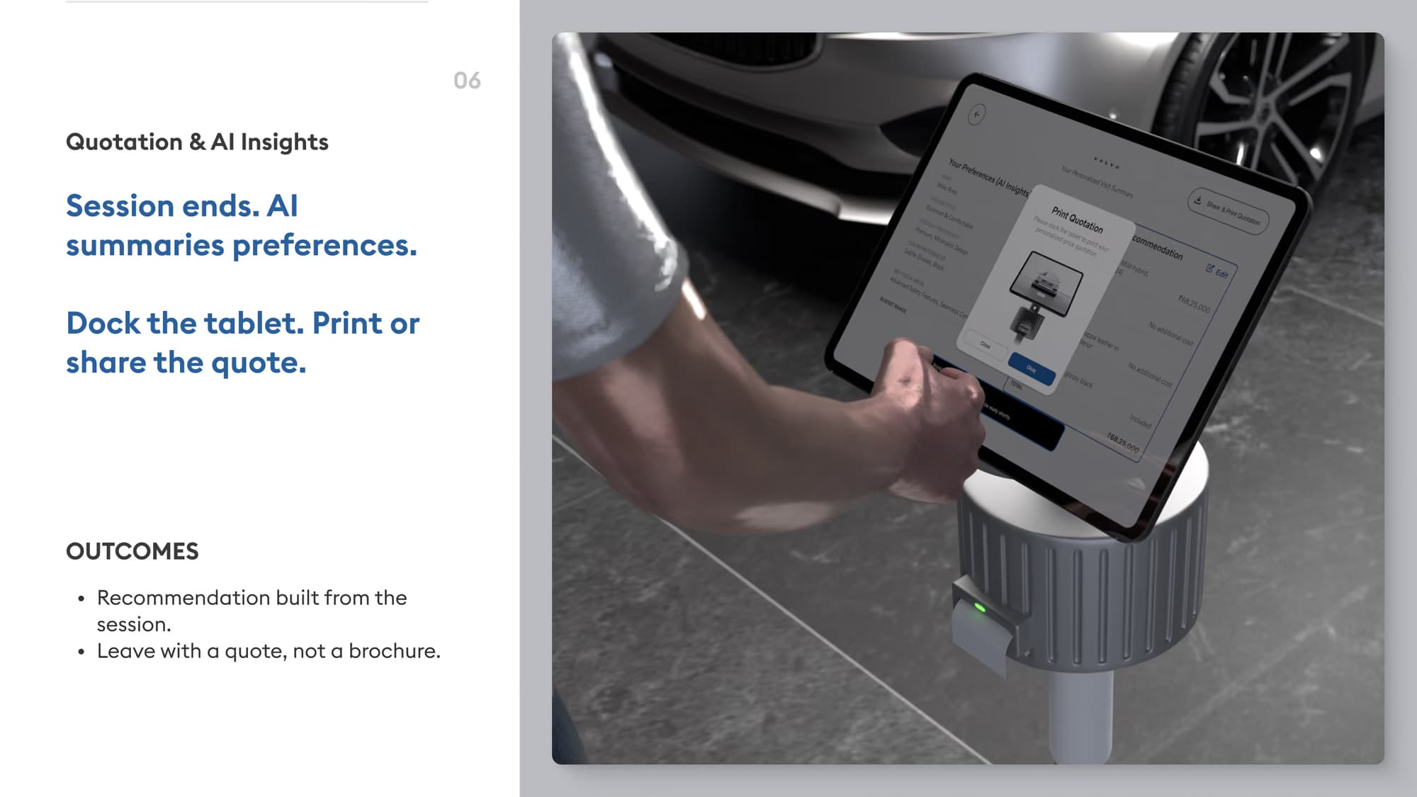
So everything you touch is kept: finishes, wheels, trims, the features you actually opened. That becomes the comparison, then the recommendation, then the quote that prints when you dock the tablet. You leave with the car you configured, not a brochure of every car.
Experience
It only works as a chain.
The room makes the dock findable. The dock gives the tablet a context. The tablet becomes a lens. AR ties the information to the vehicle. Comparison turns exploring into a shortlist. The quote turns that into something you can carry out of the building.
Break one link and the rest degrades. A dock nobody notices is a tablet nobody picks up. AR with no memory of what you liked is a demo.
One visit, start to finish.


Validation
Directional prototype testing.
I built the flow as an interactive prototype (40+ screens) and put it in front of a small group, to check the parts the whole concept rests on. Can you start without being told how? Explore on your own? Find a feature and understand it? Compare two cars unaided, and end up somewhere you would act on?

Directional prototype-testing results
What it showed.
- 87.5%
- Completed the core exploration flow without assistance
- 75%
- Compared two vehicle options without extra guidance
- 83%
- Located and understood key vehicle features
- 4.2 / 5
- Confidence in deciding, after using it
7 of 8 participants.
6 of 8 participants.
Across the features tested.
Average, self-reported.
Directional results from a small prototype-testing group, not commercial outcomes. Autodex has not been deployed in a showroom.
Outcome
What it changes in the room.
A buyer can walk up to a car, point at what they are curious about and get an answer, without waiting for someone to be free. Comparison becomes something they do themselves, and the session leaves the building with them.
- Limited self-exploration → detachable tablet and AR → 87.5%
- Difficult comparison → guided comparison → 75%
- Information overload → contextual discovery → 83%
- Decision uncertainty → comparison, AI and quote → 4.2/5
What I took from it.
Think in systems
Autodex made me stop designing screens. It works as a chain: trigger, state, action, consequence.
Whether the AR session lands depends on whether the dock got noticed and how easily the tablet came off. None of that is on a screen.
Keep cutting to the MLP
Not every good idea should survive. The strongest version is the one that stays understandable while keeping the core value.
Getting there meant cutting work I liked.
Autodex pushed me to think beyond interfaces and design the relationship between people, physical environments and digital systems.