
Canvas LMS → Unison Flow
Making a complex LMS easier to work in.
A research project that became the foundation for building an LMS from scratch.
- Role
UX/UI Designer
- Duration
4 weeks
- Scope
Faculty LMS research
and redesign
- Outcome
Research foundation for
a new LMS product
Context
Part I · Canvas LMS
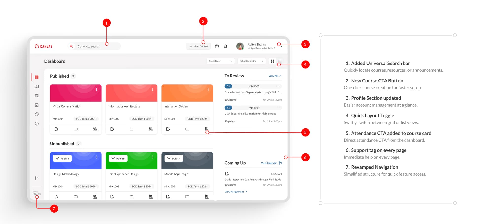
The redesigned faculty dashboard.
Research into how faculty actually use Canvas, turned into a restructured information architecture and a redesigned dashboard. A month later the same findings became the starting point for building an LMS from scratch.

Problem
Plenty of features. No clear path.
Canvas had the functionality faculty needed. The challenge was finding the right path through it: the structure made common tasks harder to find, understand and complete.
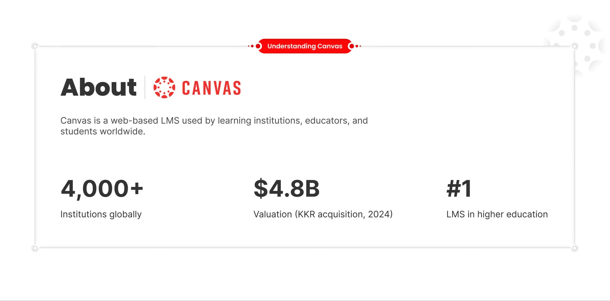
Canvas is one of the most widely used LMSs in higher education, but on the faculty side there was friction everywhere: navigation, course management, grading, finding content.
The point wasn't to make Canvas look better. It was to understand where the experience broke down, and what a better structure could look like.
How might we make complex faculty workflows easier to find, understand and complete?
Research
What the research revealed
Seven faculty interviews, diary studies and a heuristic review of course setup kept surfacing the same problems:
- Important functions were hard to find. No search or filters, and details like course settings and assignment status weren't visible where they were needed.
- Common workflows took trial and error. No templates or guidance for building courses and modules.
- Nothing had a clear hierarchy. The core tasks competed with everything else on screen.
- Grading was manual and slow. Time that should have gone to teaching went to admin.
One diary-study participant put it more bluntly:
It tries to do too much and does nothing well.


Scroll sideways to see the whole diagram.
What needed to change
- 01
- Make core faculty tasks easier to find
- 02
- Reduce navigation and decision complexity
- 03
- Build a structure that can scale
What faculty do every day should be the easiest thing to reach.
Fewer places to look, each with a clear reason to exist.
Patterns that hold up as the product grows.
Decisions
Decision 01
Restructure the information architecture
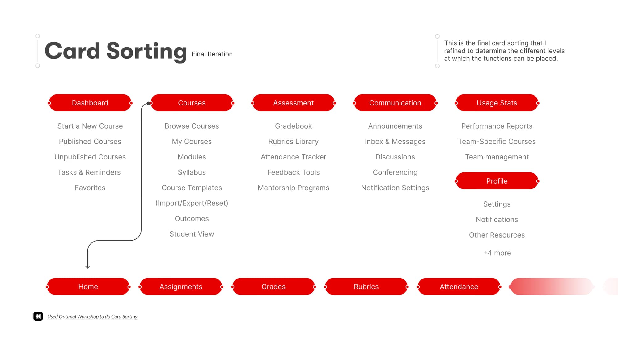
I reorganised the experience around the way faculty think about their work, rather than the way the existing product grouped its features.

Scroll sideways to see the whole diagram.
Decision 02
Test the structure
The proposed structure was tested against how people naturally grouped tasks and content.
Decision 03
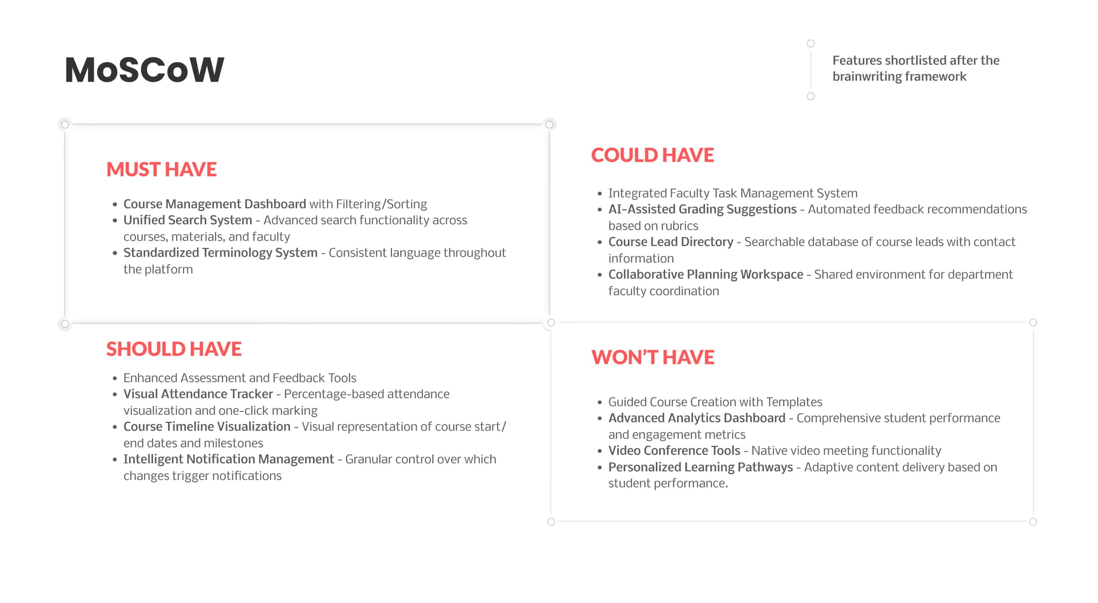
Prioritise what mattered
Not everything could be fixed at once. The research decided what went first: everyday workflows, ahead of anything that added complexity without solving a core problem.
Scroll sideways to see the whole diagram.
Decision 04
Turn structure into workflows
With the structure settled, a common faculty job (setting up a course, then grading it) became one continuous path with fewer decisions along the way: 14 interactions from start to published grades.

Scroll sideways to see the whole diagram.
Redesign
From structure to interface
This is where the structural decisions became interface decisions: what sits on the dashboard, what's one click away, and what can wait.

The system behind it
A redesign this size needed a consistent system, not a set of one-off screens.

Colour and type

Grid and icons
Testing the experience
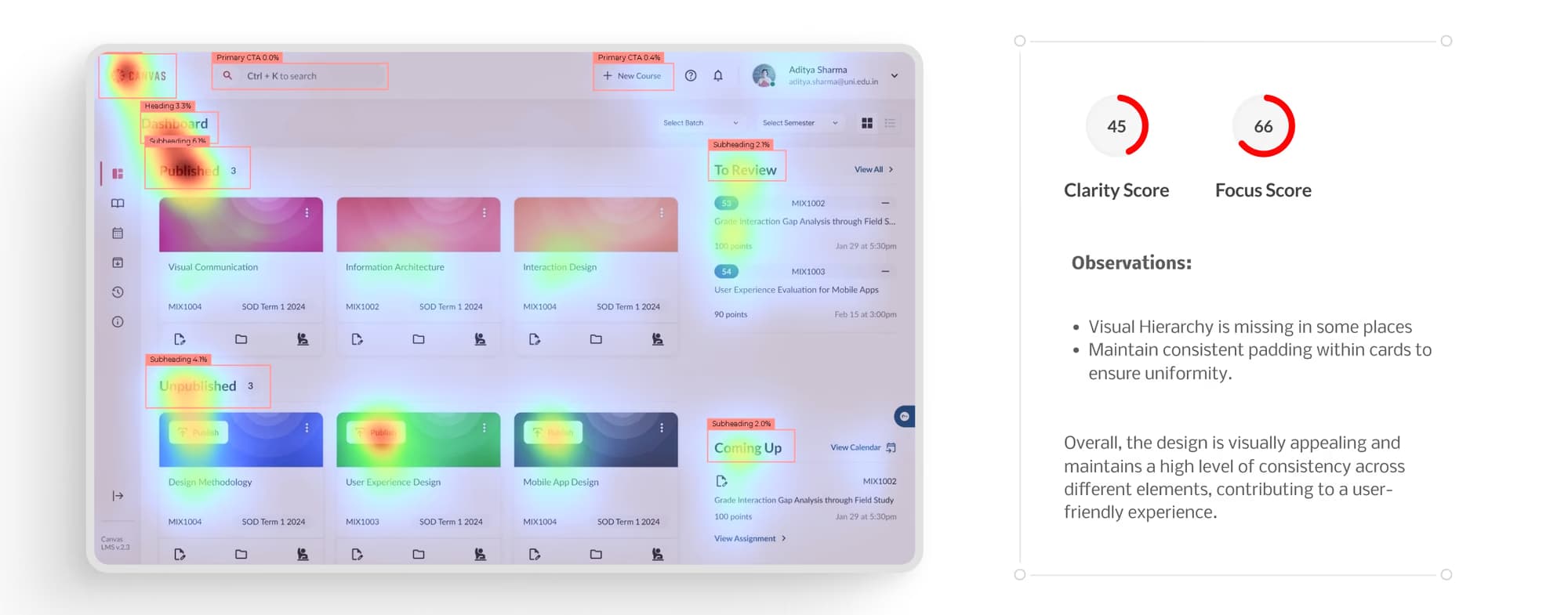
The dashboard and its patterns were tested and refined around discoverability and hierarchy.
An attention heat map scored the layout 45 for clarity and 66 for focus, and flagged weak hierarchy in places and inconsistent card padding. Both went into the final pass.
Build
Part II · Unison Flow
The research didn't end with the redesign.
A month later, I joined Unison Flow to help build an LMS from scratch. The Canvas research became the brief.

Scroll sideways to see the whole diagram.

What I owned
- Product
- Defined the IA and UX strategy from concept to MVP.
- System
- Defined and built the design system from zero.
- Team
- Mentored 2 design interns through the build.
Designed across web and mobile, 0 to 1 across all four products.
Scalable component libraries for developer handoff, and less inconsistency across the ecosystem.
Embedded testing into the build cycle, and coordinated across product, engineering and marketing.
This project is confidential. Reach out directly to learn more.
Outcome
What the research changed.
Canvas research → a clearer information architecture → product principles → a four-product ecosystem on one design language → an LMS MVP.
- 01
- Clearer navigation hierarchy
- 02
- Easier access to common actions
- 03
- Stronger information hierarchy
- 04
- More coherent interaction patterns
Reflection
What I learned
Research is worth more when it changes what gets built.
The Canvas redesign showed me the structural problems inside an LMS. Unison Flow taught me how to carry those findings into product decisions, a design system and a real 0 to 1 build.