
Voca
Interpreter-free banking for deaf customers.
A shared counter device for real-time, two-way communication. The customer signs, the teller speaks, and neither of them has to change how they communicate or bring someone along to translate.
- Role
UX & interaction design
System design · Prototyping
- Context
BUX6201 Interactive Technology Design
With Reva Rajgariah
- Research
26 interviews
IDBA Indore · SBI Nanakheda, Ujjain
- Scope
Concept to clickable prototype
ISL recognition simulated
Context
Banking assumes everyone at the counter can hear.
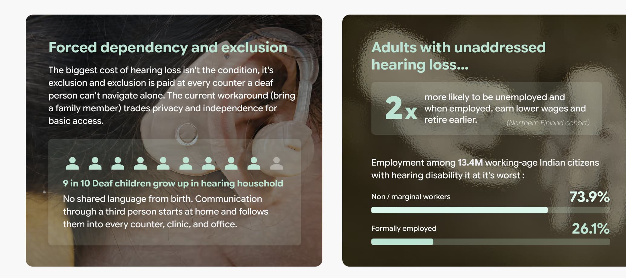
Accounts, KYC, loans, disputes. Every one of them is a spoken transaction. In most Indian branches there is nobody at the desk who signs, so a deaf customer brings a relative to speak for them and gives up privacy to get through a basic task.
The cost is not the hearing loss. It is everything a person has to give up to work around it.
Problem
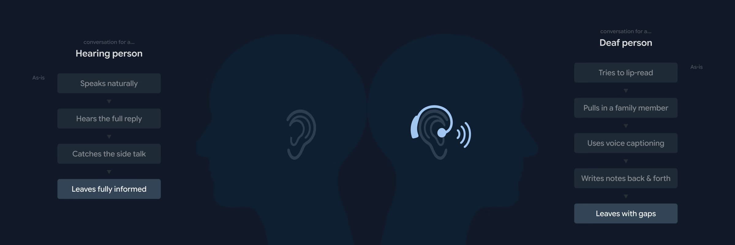
Same conversation. Two very different realities.
A hearing customer speaks, hears the reply, catches the side talk, and leaves knowing what happened. A deaf customer lip-reads what they can, pulls in a family member, writes notes back and forth, and leaves with gaps.
Translation on its own does not fix that. The hard part is holding real-time turn-taking, clarity for everyone at the desk, and privacy, all at once, between two people who do not share a modality. Solve one and the other two usually break.
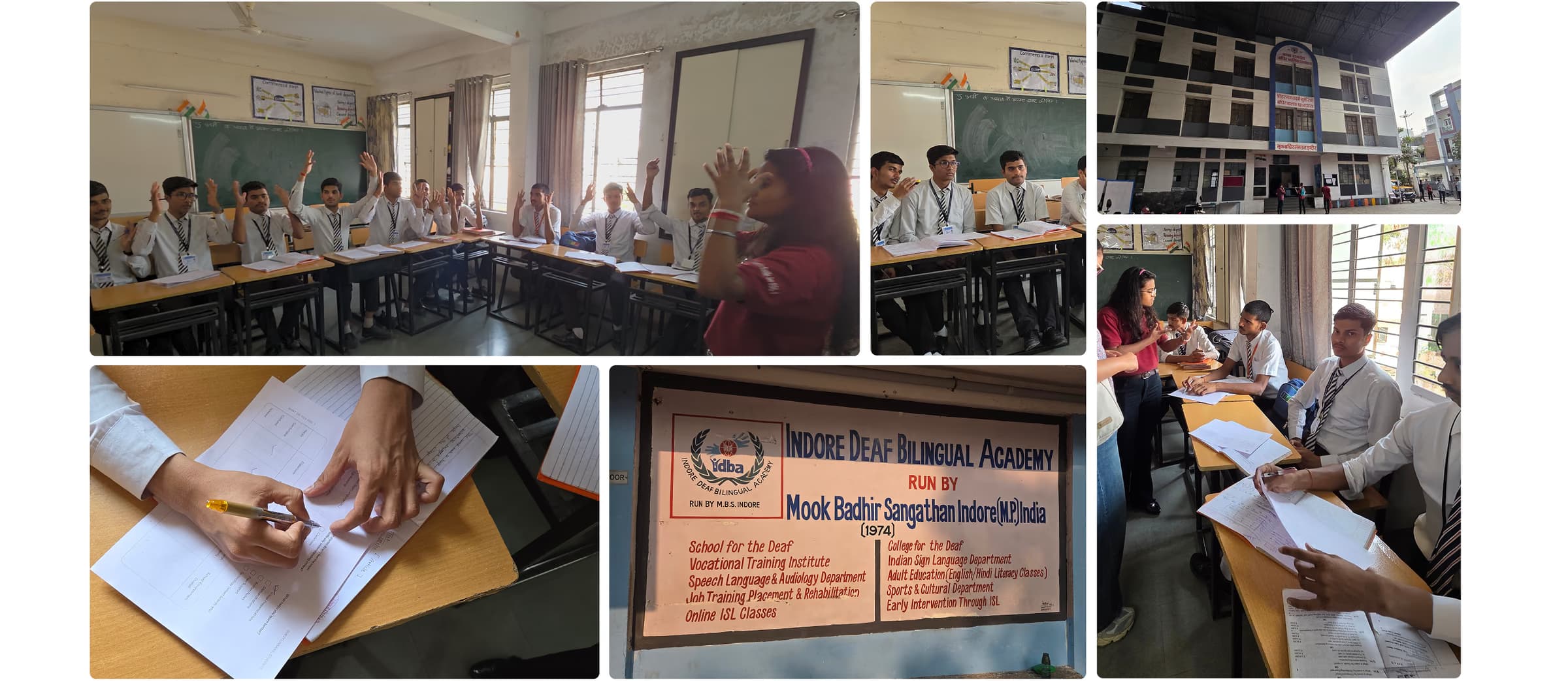
At SBI Nanakheda in Ujjain, a deaf customer's transaction ran past thirty minutes against roughly five for the hearing customers around them. At the Indore Deaf Bilingual Academy it was paper, pointing and guesswork on every visit, and no teller who could sign.
Insight
Independence became the real design constraint.
We went in expecting to design better captions. Nobody described a translation problem. They described bringing someone with them, and what that costs. A relative in the conversation means no privacy about your own money, and no way to ask a follow-up question on your own.
That reframed the brief. The target was not accuracy. It was whether one person could walk in alone and finish the task.
No companion. No switching modalities. No setup.
Direction
A shared system, not a better personal device.
The explorations split into wearables, a phone app, a staff-side tool, and a shared counter device. The personal directions kept failing the same way. They hand the deaf customer a thing to own, charge, carry and configure, which makes the customer responsible for the bank being accessible.
- Shared, not worn
- Constraint: no companion
- Installed, not set up
- Constraint: no prior setup
- Two-way, not assistive
- Constraint: no switching modalities
Accessibility belongs to the counter, so nothing depends on the customer having brought the right device or the right person.
The device is already mounted, calibrated and awake. Walking up to it is the whole onboarding.
The teller keeps speaking and the customer keeps signing. The system does the moving, not the people.

One finding broke the first version. Many counters have a glass partition, and the teller's voice does not reach a device sitting on the customer's side of it. No screen design solves a physical problem, so the system became two devices: the counter sphere, and a handheld the teller holds and presses to speak.
System
Two pipelines, running in opposite directions.
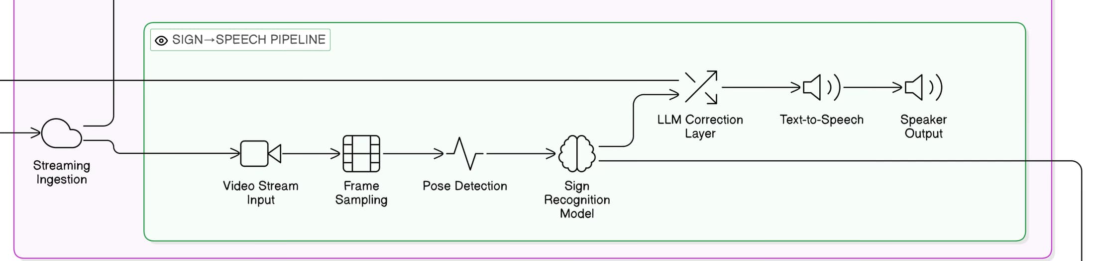
Both people talk into the same device and neither changes how they communicate. That only works if the system carries two complete paths at once and keeps them close enough in time to hold a turn.
Staff speaks, customer reads
Bank staff speaks
↓ Microphone and speech recognition
↓ Language layer turns the sentence into ISL gloss
↓ Avatar signs it, captions underneath
Deaf customer reads it
Customer signs, staff hears
Deaf customer signs
↓ Camera and pose detection
↓ Sign recognition, then a correction layer
↓ Sentence is spoken aloud
Bank staff hears it
Everything below this point is the proposed architecture for the concept. It is designed and specified, not built or deployed, and the prototype simulates the recognition steps rather than running them.

Scroll sideways to see the whole diagram.
Scroll sideways to see the whole diagram.
The routing layer exists for an unglamorous reason. Cost and latency. Short, predictable turns go to a small model and most turns are short. Anything financial goes to a larger one. A sync engine buffers the avatar so it does not stutter when output switches between precomputed clips and generated animation.

Scroll sideways to see the whole diagram.
Interaction
What a turn actually feels like.
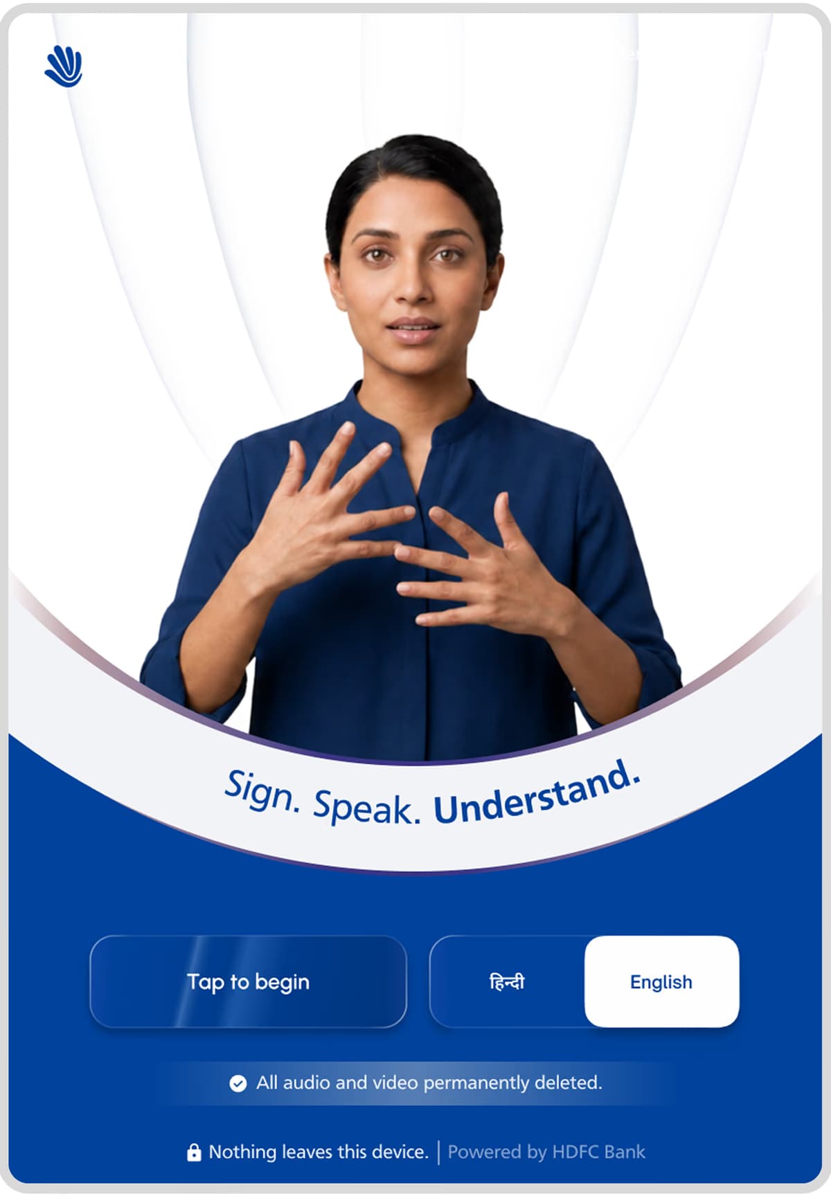
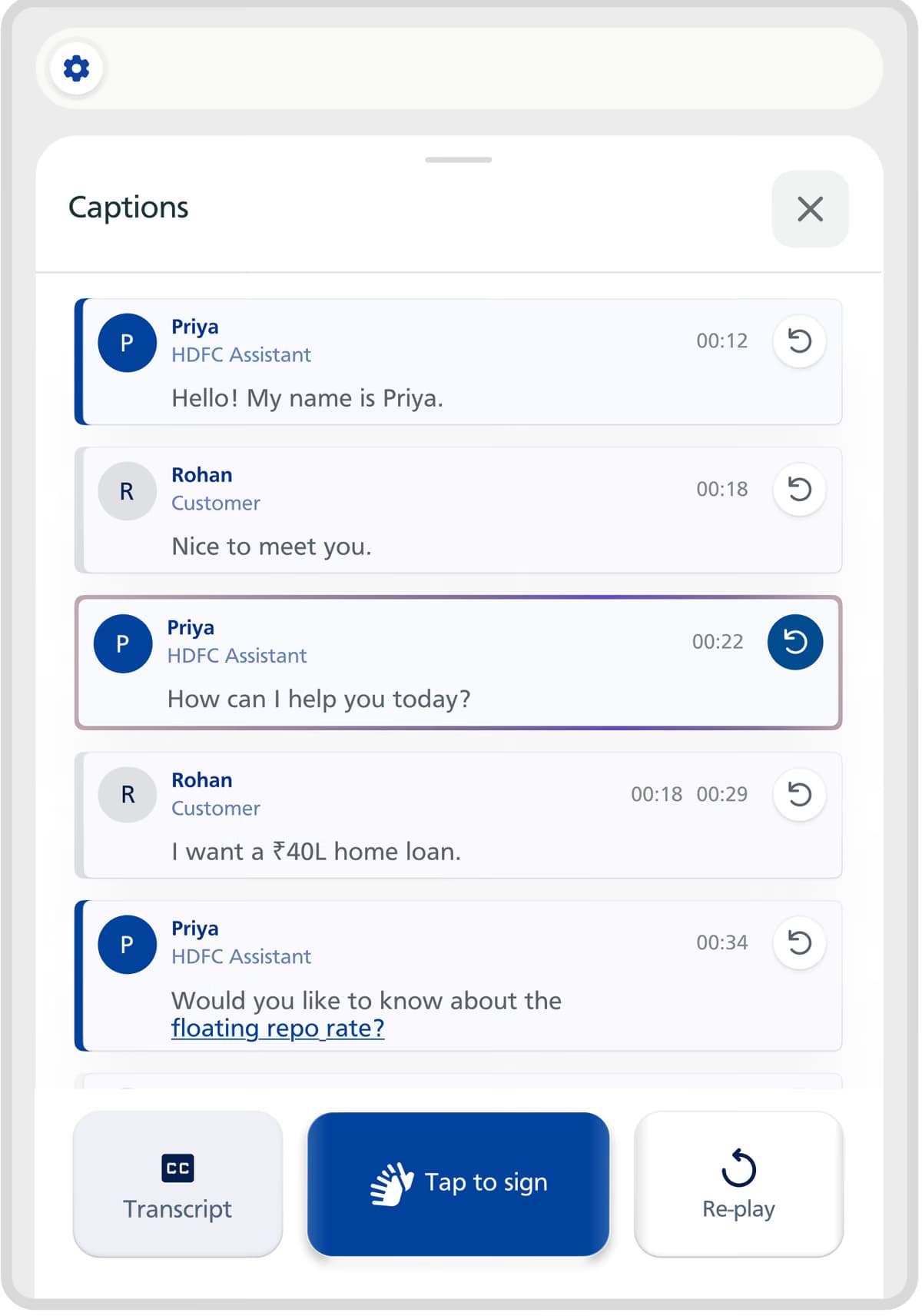
Nine screens and five overlays, but the model is one loop. Someone takes a turn, the other person sees it arrive, and either of them can ask for it again without stopping the session.




Decisions that shape the model
- Signing is explicit. Tap to sign, sign, drop hands. The camera never quietly reads the room, because a device that is always watching is a device people sit differently in front of.
- Speaker identity uses three channels. Colour, name and a dot. Never colour alone.
- Replay sits next to the avatar, not buried in history. Missing a sentence is normal, not an error state.
- Captions are Hindi first, English below. Any term can be tapped for a plain explanation, which is where most of the financial confusion actually lives.
- The right status pill is amber or hidden. Never green. Two live states never share a colour, so a glance is enough to know whose turn it is.
- Recognition failures are a turn, not an error screen. The system says it did not catch that and offers another way through, including typing.
- Ending a session erases the audio and video, and shows that happening rather than claiming it in a footer.

Product
Designing the device around the conversation.
The hardware has three jobs. Put a camera where the hands are, put a microphone where the voice is, and not feel like security equipment.

The camera sits at signing height rather than at the top of the screen, because hands carry the message and a top-mounted camera crops them. Counter heights run between roughly 90 and 110 centimetres, so the hinge tilts and locks once at installation instead of being nudged by every customer.
The microphone array listens in all directions and hands off to the teller's handheld when a glass partition makes that pointless. The screen is 8.4 inches on a 120 degree hinge, and the whole thing stands about 310mm tall and 142mm wide, which keeps it inside the working area of a standard counter.
The shell is fabric. Every other surface at a bank counter is glass, steel or laminate. A soft object reads as approachable before the screen even turns on, which matters when this is the thing standing between someone and their money.

Prototype
Built, and honestly not finished.
The prototype is a clickable build covering the attract screen, onboarding, an active session across all seven header states, the captions drawer and glossary, settings, and the full session end and deletion flow, in Hindi and English. The teller handheld is represented through renders and simulated pairing.
Simulated, not live
- ISL recognition is scripted. There is no live computer vision behind it.
- The avatar is animated rather than generated output.
- Speech recognition ran through the browser API in development only.
What would have to be validated next
- Recognition accuracy on real signing, with real variation in speed, regional dialect and framing.
- End to end latency on a branch network rather than a laptop.
- What happens when the system is confidently wrong, and whether either person can tell before acting on it.
- Whether tellers pick the handheld up at all, or fall back to the paper workaround under queue pressure.
- Whether "nothing leaves this device" is believed, not just read.
We set targets to design against rather than to report: recognition above ninety percent, under two seconds end to end, fewer than three clarification loops in a session. None of them have been measured with users. Testing with students at IDBA is the next step, and it is the part that would decide whether any of this holds.
Reflection
Accessibility is treated as a feature. It should be infrastructure.
A feature is optional, and optional accessibility is the first thing switched off when a branch is busy. Infrastructure is already there, already calibrated, and the same at every counter. Voca only works if it is the second kind, and that turned out to be a decision about where the device lives rather than anything on the screen.
The other thing this changed for me is how I treat a model in a product. Most of the interesting design work here was not the path where recognition works. It was the turn where it does not: how the system admits it, how a person recovers without losing their place in the conversation, and how quickly it has to fail to still feel like talking. Latency, trust and recovery were the interaction design, not the engineering detail underneath it.
What I would do differently is the teller. We researched deaf users carefully and treated bank staff as a constraint to design around. They are the other half of the conversation, and we gave them a button.